

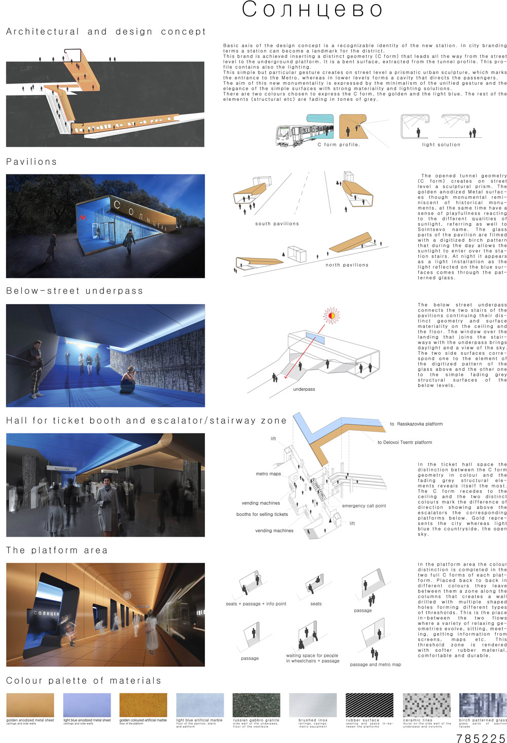
Concept
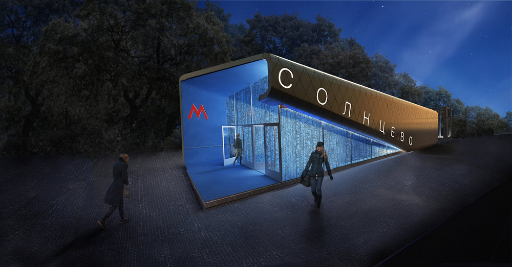
Basic axis of the design concept is a recognizable identity of the new station. In city branding terms a station can become a landmark for the district.This brand is achieved inserting a distinct geometry (C form) that leads all the way from the street level to the underground platform. It is a bent surface, extracted from the tunnel profile. This profile contains also the lighting.This simple but particular gesture creates on street level a prismatic urban sculpture, which marks the entrance to the Metro, whereas in lower levels forms a cavity that directs the passengers.The aim of this new monumentality is expressed by the minimalism of the unified gesture and the elegance of the simple surfaces with strong materiality and lighting solutions.There are two colours chosen to express the C form, the golden and the light blue. The rest of the elements (structural etc) are fading in tones of grey.
Pavilions
The opened tunnel geometry (C form) creates on street level a sculptural prism. The golden anodized Metal surfaces though monumental reminiscent of historical monuments, at the same time have a sense of playfullness reacting to the different qualities of sunlight, referring as well to Solntsevo name. The glass parts of the pavilion are filmed with a digitized birch pattern that during the day allows the sunlight to enter over the station stairs. At night it appears as a light installation as the light reflected on the blue surfaces comes through the patterned glass.
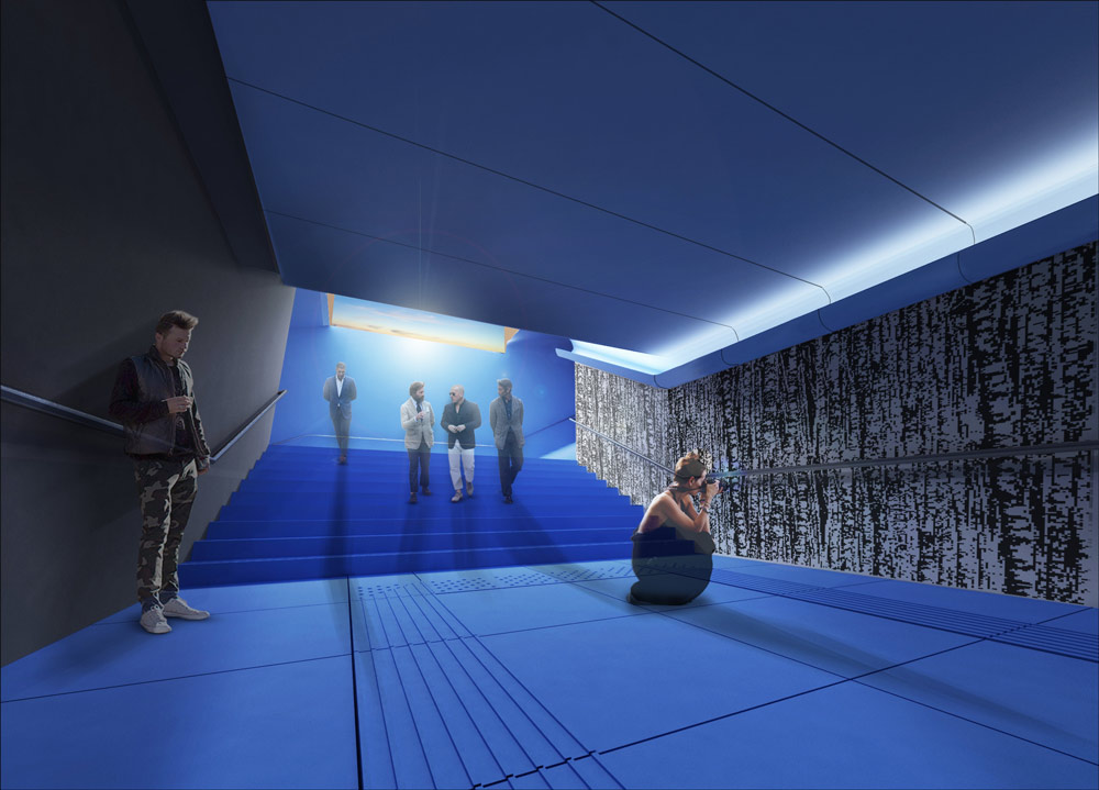
Below-street underpass
The below street underpass connects the two stairs of the pavilions continuing their distinct geometry and surface materiality on the ceiling and the floor. The window over the landing that joins the stairways with the underpass brings daylight and a view of the sky.The two side surfaces correspond one to the element of the digitized pattern of the glass above and the other one to the simple fading grey structural surfaces of the below levels.
Hall for ticket
In the ticket hall space the distinction between the C form geometry in colour and the fading grey structural elements reveals itself the most. The C form recedes to the ceiling and the two distinct colours mark the difference of direction showing above the escalators the corresponding platforms below. Gold represents the city whereas light blue the countryside, the open sky.
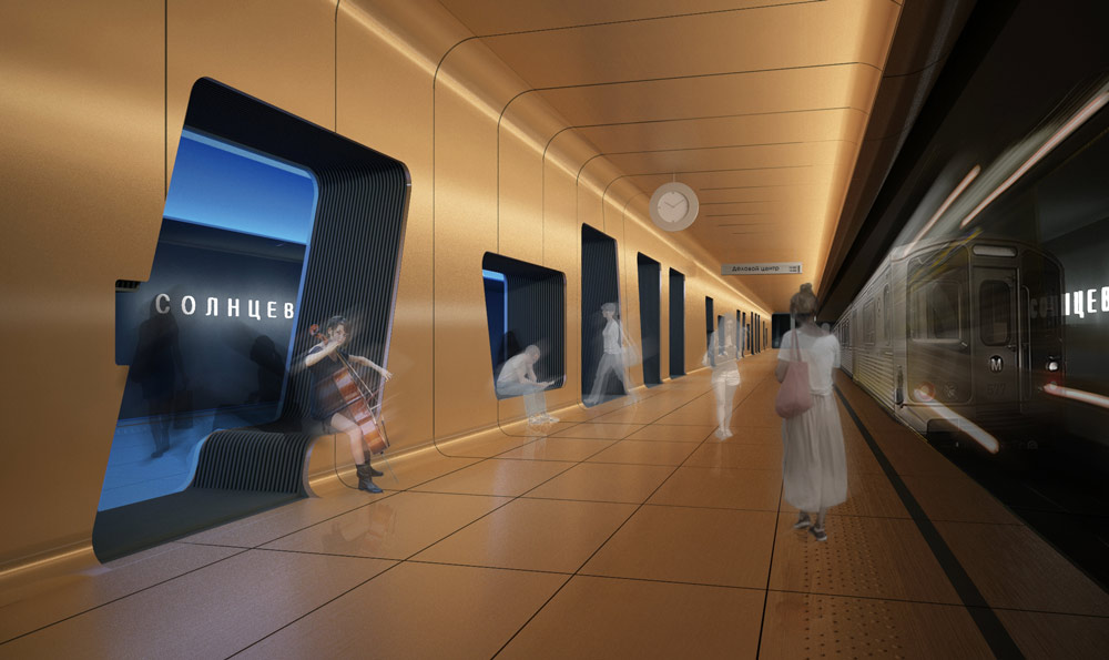
The platform area
In the platform area the colour distinction is completed in the two full C forms of each platform. Placed back to back in different colours they leave between them a zone along the columns that creates a wall drilled with multiple shaped holes forming different types of thresholds. This is the place in-between the two flows where a variety of relaxing geometries evolve, sitting, meeting, getting information from screens, maps etc. This threshold zone is rendered with softer rubber material, comfortable and durable.
hiboux architecture (Dimitris Theodoropoulos, Marianna Xyntaraki, Maria Tsigara) + Chrysanthi Vathi + Antigoni Karaiskou
Σύλληψη
Βασικός άξονας σχεδιασμού είναι η έντονα αναγνωρίσιμη ταυτότητα του νέου σταθμού. Με μια λογική city branding όπου κάθε σταθμός συνδέεται με την συγκεκριμένη πόλη αποτελώντας ένα τοπόσημο, εισάγουμε μια αναγνωρίσιμη γεωμετρία/μορφή (σχήμα C) που οδηγεί από το επίπεδο της πόλης μέχρι το επίπεδο των πλατφορμών. Η γεωμετρία αυτή είναι μια κυρτή επιφάνεια που προέρχεται από τις γεωμετρίες του τούνελ και παράγει η ίδια τον φωτισμό.Είναι μια χειρονομία απλή και ταυτόχρονα ιδιαίτερη η οποία στο επίπεδο της πόλης δημιουργεί ένα πρισματικό αστικό γλυπτό που σηματοδοτεί την πύλη στον υπόγειο χώρο ενώ στις υπόλοιπες στάθμες επαναλαμβάνεται ως κοίλωμα που παραλαμβάνει ή οδηγεί τους επιβάτες [προς τις πλατφόρμες]. Το νέο είδος μνημειακότητας συνδέεται με την έννοια του μινιμαλισμού που εισάγει η ενιαία χειρονομία αλλά και την κομψότητα των απλών επιφανειών με τα ενδιαφέροντα υλικά και τις φωτιστικές τους ποιότητες/ιδιότητες. Οι γεωμετρίες γίνονται αντιληπτές με δύο χρώματα (χρυσό και γαλάζιο) ενώ τα υπόλοιπα στοιχεία (προυπάρχοντα δομικά τμήματα κτλ) είναι σε αδρό γκρι χρώμα
Pavilions
Η αναπαραγωγή της γεωμετρίας του τούνελ (σχήμα C) παράγει στο επίπεδο της πόλης μια γλυπτική επιφάνεια- πρίσμα. Οι χρυσές ανοδιωμένες επιφάνειες του από τη μια θυμίζουν τα ιστορικά μνημεία της πόλης και ταυτόχρονα έχουν μια παιγνιώδη διάσταση σε σχέση με τις διαφορετικές ποιότητες του ηλιακού φωτός, αναφερόμενες και στο όνομα της περιοχής (solntse σημαίνει ήλιος στα ρωσικά). Η είσοδος του πρίσματος κλείνει με τζάμι το οποίο έχει ένα ψηφιοποιημένο μοτίβο σημύδας. Το πάτερν του τζαμιού επιτρέπει την ημέρα στο φως να μπαίνει στον σταθμό ενώ το βράδυ το μετατρέπει σε ένα φωτιστικό γλυπτό.
Υπόγειο πέρασμα
Η οροφή του υπόγειου περάσματος ακολουθεί την γεωμετρία και την επιλογή υλικών του pavilion. Η μια παράπλευρη επιφάνεια ντύνεται με ψηφιδωτό πλακάκι αναπαριστώντας ένα ψηφιοποιημένο δάσος σημύδας. Η απέναντι της ντύνεται με ρώσικο αδρό γκρι γρανίτη. Οι δύο αυτές πλαϊνές επιφάνειες ανταποκρίνονται η πρώτη στο ψηφιοποιημένο μοτίβο σημύδας του τζαμιού του pavilion και η δεύτερη στις γκρι δομικές επιφάνειες που υπάρχουν στις υπόγειες στάθμες. Ένα άνοιγμα ψηλά πάνω από το πλατύσκαλο εισάγει το φως της ημέρας στο πέρασμα και επιτρέπει την θέα προς τον ουρανό.
Χώρος εισιτηρίων
Στον χώρο των εισιτηρίων η διάκριση μεταξύ της C γεωμετρίας και του γκρίζου δομικού υπόβαθρου γίνεται πολύ εμφανής. Η ανάπτυξη σε C μορφή περιορίζεται στην οροφή ενώ έχει διακριτό χρώμα προς κάθε την κάθε πλατφόρμα (από και προς το κέντρο της Μόσχας). Το χρυσό αντιστοιχεί στην πόλη ενώ το γαλάζιο στην εξοχή και τον ουρανό.
Πλατφόρμα
Στην περιοχή των πλατφορμών η γεωμετρία του κοίλου επαναλαμβάνεται για κάθε κατεύθυνση με το αντίστοιχο χρώμα. Η ζώνη κατά μήκος της συστοιχίας των κολονών κλείνεται σχηματίζοντας έναν συμπαγή τοίχο ο οποίος ξετρυπιέται για να φτιάξει περάσματα και καθιστικές περιοχές. Είναι ένας ενδιάμεσος χώρος όπου αναπτύσονται διάφορες γεωμετρίες ανάπαυσης, καθιστικά, σημεία συνάντησης, λήψης πληροφοριών από οθόνες, χάρτες κτλ. Αυτή η ζώνη-κατώφλι ντύνεται στο σόκορο της με λαστιχένιες λωρίδες, υλικό άνετο και ανθεκτικό για καθιστικό.
hiboux architecture(Δημήτρης Θεοδωρόπουλος, Μαριάννα Ξυνταράκη, Μαρία Τσιγάρα) + Χρυσάνθη Βάθη + Αντιγόνη Καραϊσκου